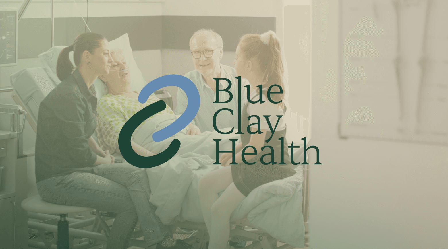


What We Built
We started with Blue Clay Health — logo, visual identity, brand guidelines, voice and tone, audience-segmented messaging for both patients and physicians, and the communication materials the founder needed to pitch, recruit, and launch. The design language was deliberately warm: caring typography, natural photography, a palette that feels reassuring rather than sterile. The messaging principle was simple — explain complex processes in ways a ten-year-old can understand.
From there, we defined the rest — social content strategy, LinkedIn posts, newsletters, infographics, key selling points, and messaging for a complex set of stakeholders from patients and families to physicians and investors. LinkedIn has grown to 3,000+ followers.
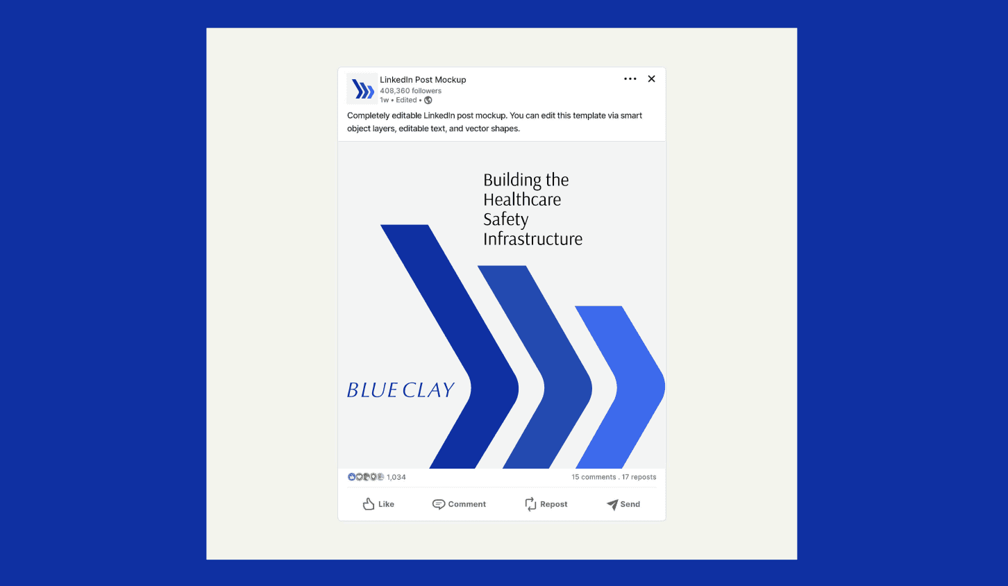
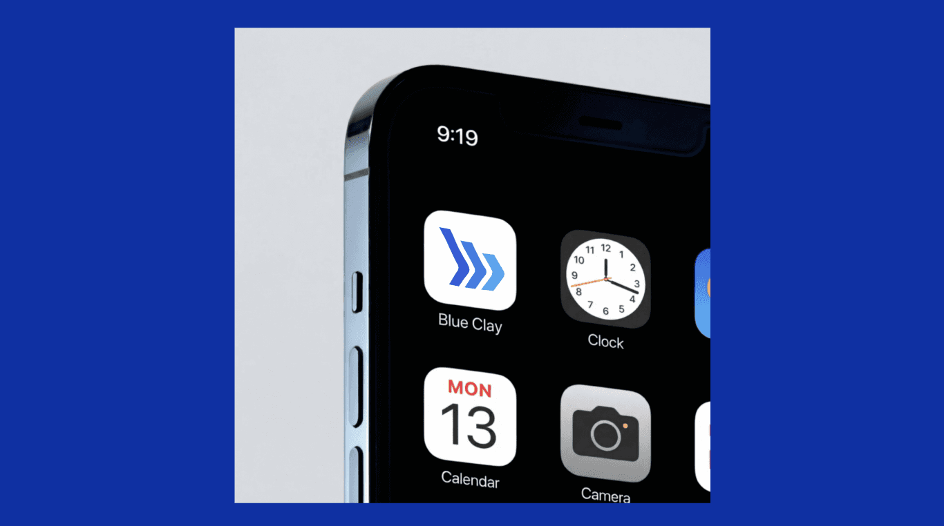
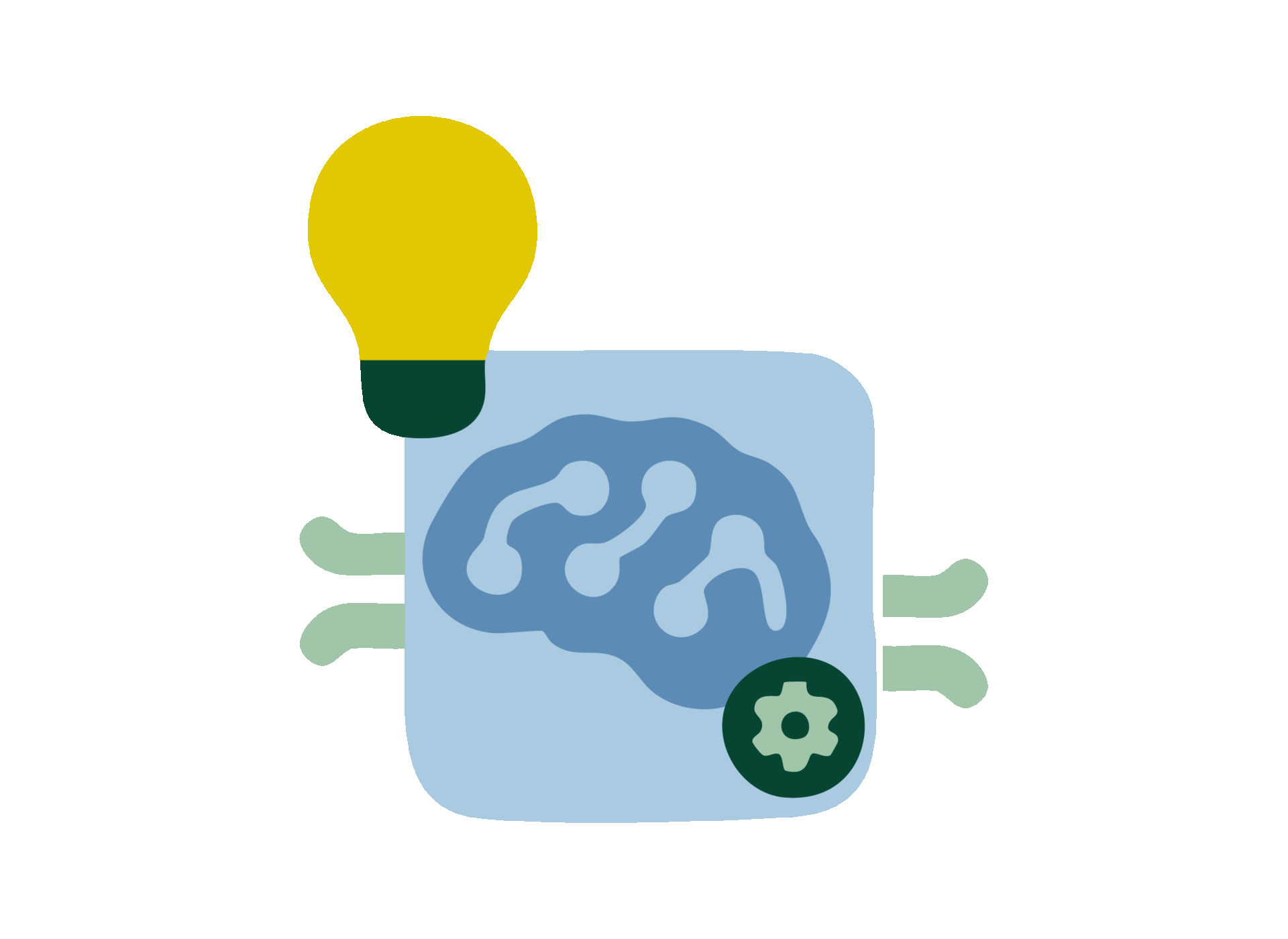
Then we built Blue Clay.AI as the technology brand — a sharper, bolder identity that signals innovation and infrastructure while staying connected to the parent mission. The initial brand was built in under a week to meet a launch deadline.